
Chapter 13 Chapter Three
Zhangfa is the composition method of seal cutting works, which is to conceive and arrange various form elements of the seal surface, that is, to design the structure and layout of the seal surface.Also known as Fenzhububai.Since the existence of seals, hundreds of thousands of seals have been produced in thousands of years, and there have been ever-changing and almost identical layouts.There is such a rich and infinite art cave in a square inch of land. When we admire the works that embody the wisdom and artistic creativity of the past generations of Indians, we will carefully analyze the composition of the composition, and we will find that the ever-changing composition forms run through. Unity seeks the law of harmony.If there is any mystery in the seal cutting method, it is to use the law of the unity of opposites to carry out artistic processing such as density, virtual reality, symmetry, and echoing of formal elements such as printed text, blank space, and sidebars, so as to achieve both change and harmony. artistic effect.
When conceiving the composition, it is mainly to plan the position, font shape, and stroke lines of the printed text.There are several ways to arrange printed characters in ancient seals:
The interleaving and shifting of printed characters can alternately intersperse radicals, intersperse strokes, move the position of the left and right radicals, move the position of the upper and lower structures, shift to the side or shift to the level, move the outside to the inside, deform and intersperse the strokes, or deform the strokes Variable Bit.
Increase and decrease strokes of printed text Add strokes, reduce strokes, simplify radicals, merge strokes and save pictures, borrow and merge radicals, etc.
Adjust the shifting text to make oblique symmetry, character symmetry, vertical echo, red echo or cross echo, etc. for traditional and simplified strokes and printed text.
The strokes are exaggerated and deformed, tight on the inside and loose on the outside, enclosing the real with the imaginary, or tight on the outside and loose at the inside, enclosing the empty with the real, enlarging the initial strokes or lengthening the drooping strokes.Make the printed surface dense and scattered, full of artistic conception.
The seal cutting method fully reflects the characteristics of the layout and structure of the seal.The blank space not only enhances the expressiveness of the printed text, but also makes the lines of the printed text stand out by using Zhu Tuobai (white text printing) or white lining Zhu (Zhu Wenyin).It also plays a role in coordinating the composition structure, spatial echo, tone and rhythm of the seal, and is crucial to the formation of the seal's artistic style.Therefore, when conceiving the printed text and operating the composition, the size and image of the blank space should be considered at the same time.Although the cloth white in the seal does not have the function of implying a certain image like the blank space in the painting, because the formal factors of the seal are relatively simple, the cloth white plays an important role in forming the aesthetic feeling of the seal form.Bubai has an interdependent relationship with Fenzhu in the seal method.The sidebars and borders of the seal are also the formal factors of the composition of the seal. Using the thickness and intermittent changes of the sidebars and borders, borrowing, forcing, and hitting the edges can often enhance the stability or flexibility of the seal.To conceive the seal method is to coordinate and deal with the above-mentioned formal factors and structure the layout of the seal surface.
The composition of the seal presents a rich and colorful artistic style. If you want to make a generalized summary, it can be divided into two forms: normal and natural and strange and dangerous.Now try to cite several printing examples, and analyze the artistic processing techniques of these two types of composition.
The "Stable General Seal" is a seal of the Qin Dynasty.The printed text is neat and elegant, and the strokes are full of the mood of roundness and flow.The grid of matt characters enhances the sense of regularity, and allows each character to have a space to move. The printed text is arranged in reverse, which makes this seal have ethereal and lively changes in the solemn and regular.
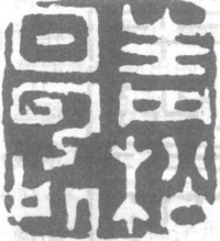
"Junqu Houyin" Hanman Baiwenyin.It has the typical characteristics of Han and Dabai seals: the seal structure is regular, the strokes are straight, the lines are evenly spaced, the lines are well-proportioned, and the layout is full on all sides, forming a plump, heavy, graceful and elegant artistic style.This print does not have a sidebar frame.Since each character has an outline formed by elongated strokes, it naturally creates neat sidebars and boundaries, resulting in a loose central palace, avoiding the disadvantages of rigidity and congestion that are easy to occur when regular and full.The characters of the two seals are square, the strokes are sparse and dense, the turning angles are similar, and the arrangement is regular.Form a flat and well-proportioned layout, and feel plain and natural.To deal with this kind of rules and regulations, we must avoid rigidity and lack of change.

Stable General Chapter

Junqu Houyin
The seal of "Hometown of Articles and Justice", engraved by Wu Changshuo.This is a seal example that uses the interspersed strokes of the printed text to form the density of the lines and the cloth in the square layout, and the echo of the virtual and the real, so that the composition is stable and varied.Among the six characters in the printed text, four characters have more complex strokes. Two characters and three lines are used to spread them on the printing surface. A large blank is created, which echoes the broken white cut out by the two sparse lines of "Wen" and "Zhi" above, forming the density change of the whole print.Moreover, the dense strokes of the characters "Zhang, Jie, Yi, Xiang" are in the shape of genuine characters, interlaced with the inverted characters with more blank space, forming a virtual and real echo, so that the whole seal method contains intricate changes in the plain and natural. Stable but not dull, intriguing.

Hometown of Articles
"Lailucaotang", the work of Hu Ying (juejue) in the Qing Dynasty.Use thin vermilion text, round transitions and intermittent fine lines to form the lyrical charm required by the printed text.Among the four characters, "Lu" has the most complicated strokes. The cursive characters use the simplest seal method, the hall characters are simplified, and the two herringbone characters of the original characters are combined.In this way, the lines of printed strokes are dense and harmonious, so that the composition is balanced and stable.This is a way of interspersing and shifting the seals to form a stable seal.
An example of adding, subtracting, merging or repeating the strokes of the seal to achieve harmony and stability is "Liu Yinxuan", written by Qi Baishi.All printed three characters, arranged in a square composition, arranged in two rows.In order to make the first two characters not feel too crowded, the character "Yin" has been simplified and merged.The character "Xuan" in the second line has the radical of the character Che added.One increase and one decrease, resulting in the stability of the rules.This increase or decrease is also in line with the rules of seal law.

Come to Heron Cottage
"Qianqiu" is an example of adding printed strokes.A more complicated technique is adopted to expand the fire part of the character "Autumn" to the center of the printed surface, and the grains of the characters "Qian" and "Autumn" are listed on both sides of the fire part, forming a strong man carrying a burden. , to achieve the goal of a smooth, symmetrical and interesting layout.
"The place of green pines and white clouds" was written by He Zhen in the Ming Dynasty.It is a printing example that simplifies the printed text and saves the initials according to the layout requirements.The whole printed five-character cloth is placed on the square printing surface, arranged in two rows of two or three characters. In order to make the weight of the two rows equal, the two rows of three characters are greatly deleted and the small ones are reduced, so that the composition is symmetrical and harmonious.

Liu Yinxuan
Use borders to deal with the imprint of a stable style.The double fine vermilion frame has played a role in the stability of the composition, so that the "He" character with only one simple stroke is not thin, but has a soft and graceful rhythm. The first stroke of the word "He" is treated obliquely and vertically, which enriches the linear changes in the flat lines of the double frame. A broken edge is arranged under the inner frame, so that the strict double frame has a ventilating place and strengthens the word "He". The vitality of rooting, stretching and growing upwards creates a dynamic and static contrast between the printed text and the frame.The above are common methods for arranging a smooth and well-proportioned style.

Chiaki
Green pines and white clouds
A commonly used method is to use the difference between the complex and simple strokes of the printed text to make the sparse parts of the printed surface more sparse and the dense parts denser. Create a contrasting effect.
The seal of "Pingyin Dusigong" can be an example of this type of constitution.All five characters are printed, the strokes of the first three characters are relatively complicated, but they are arranged in one line, forming a gray tone block composed of dense lines and many blank pieces, forming a smooth and smooth line with the second line of "Si Gong" In contrast with the eye-catching color blocks composed of neat cloth and white, there is a strong contrast in terms of the relationship between reality and reality and light and heavy textures.

millet
The "Uding" seal is a seal example that uses the density and density of the printed strokes, the change of thickness, and the oblique alignment of the strokes to create a jagged and scattered layout.The traditional and simple characters are different, but occupy the same position on the printed surface, while the traditional Chinese characters with black characters are filled with tops and feet, forming a concise combination with the Chinese characters with thick and exaggerated strokes.

Pingyin Dusigong

Udin
The "Yu Nian" seal uses the oblique orthographic technique of the strokes. The initial of the Yu character is separated from the Wu part and misplaced, and the vertical stroke of the year character is inclined inward, which makes the printed surface full of momentum and the contrast between reality and reality, resulting in a strange and vivid composition. .
The "Feng De" seal is another example of a moderately exaggerated printed text, interspersed with each other to form a strange and changing layout.The two characters are printed horizontally, and the horizontal strokes of the two characters are arranged on the horizontal 1/3 of the printing surface. The lines are thick and straight, creating a static contrast of vermilion and white. , all transformed into dynamic vertical lines, so that the square-inch printed surface is intertwined with the contrast of horizontal and vertical lines, the contrast of light and dark tones, and the contrast of dynamic and static.Aftertaste of Yu Gan, it is admirable for the meticulous ingenuity and strange and bold processing of ancient seal carving craftsmen.

Yu Nian

Feng De
Stable General Chapter
Junqu Houyin
Hometown of Articles
Come to Heron Cottage
Liu Yinxuan
Chiaki
Green pines and white clouds
millet
Pingyin Dusigong
Udin
Yu Nian
Feng De